top of page
Honeycomp
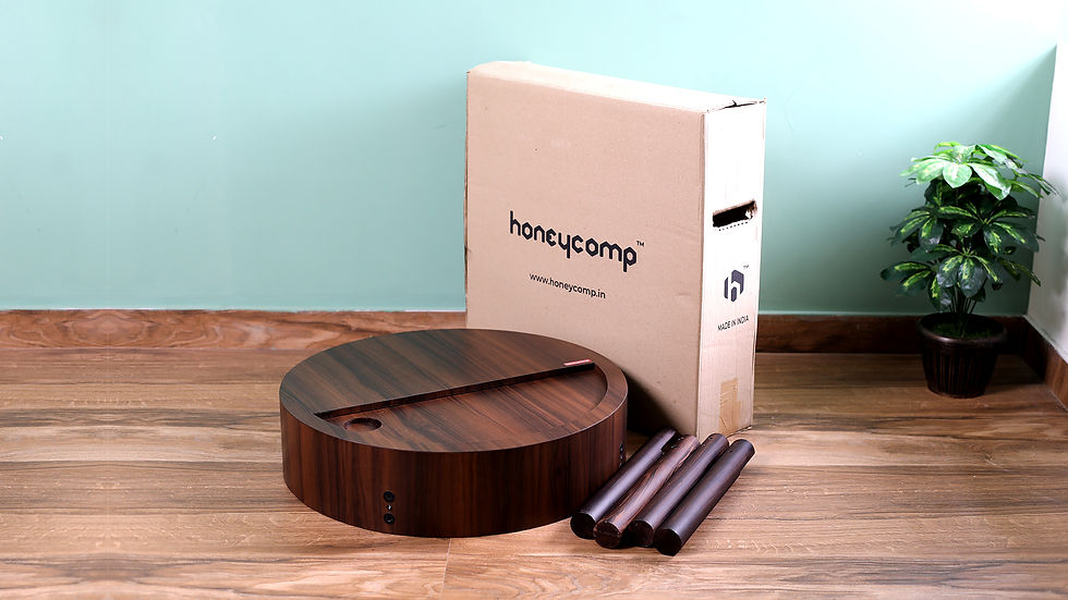
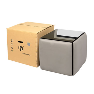
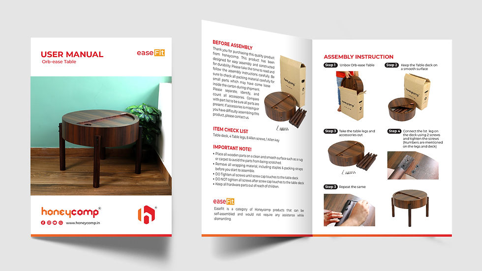
Honeycomp is an Indian brand specializing in compact, space-saving, and multi-purpose furniture.
The logo for Honeycomp embodies the essence of compactness, versatility, and the intricate organization found in nature's honeybee hives.
A stylized hexagonal honeycomb structure emerges, symbolizing the core values of efficiency and space optimization. Each hexagon within the honeycomb represents a unique piece of furniture, seamlessly fitting together like a puzzle to maximize utility in any living space.
The color palette transitions from warm oranges to rich reds, evoking the hues of golden honey and the vitality of the beehive. This palette instills a sense of warmth, energy, and sustainability, reflecting Honeycomp's dedication to eco-conscious practices.



Additionally, The icon design for Honeycomp encapsulates the brand's essence: harmonizing nature's precision with innovative design.
With its hexagonal honeycomb pattern subtly incorporating the letter "H," the icon reflects the commitment to efficiency and space-saving solutions.
Versatile and adaptable, this icon serves as a timeless emblem across various applications, from product labels to digital branding and signage, embodying Honeycomp's promise of marrying form and function seamlessly.



BRAND IDENTITY DESIGN
Other projects


Works


bottom of page